Tuesday, 12 July 2011

Monday, 9 May 2011
Abandon Evaluation - Technology

Blogger - "Blogger is a blog-publishing service that allows private or multi-user blogs with time-stamped entries. It was created by Pyra Labs, which was bought by Google in 2003. Generally, the blogs are hosted by Google at a subdomain of blogspot.com." - Source: www.wikipedia.org
This was my first time ever blogging. I know what you're thinking, "a teenager that doesn't know how to blog!?" but yes, sadly it's true. It was entirely new to me. It was strange watching my class mates excel instantly at something I knew absolutely nothing about. After a while I caught up but it did and has slowed me down at points, however now I feel fairly comfortable with the process and feel I have achieved a new attribute through blogging for Abandon, a skill which will definitely come in handy in this ever evolving online world.

Samsung Pixon 12- I purchased this Samsung beauty nearly 2 years ago and it is honestly one of the best purchases I have ever made. I basically bought this phone for it's practical media application. It's impressive 12 mega pixel camera allowed me to shoot all my photos for abandon on the move and in stunning quality. The fact that the photos then instantly came out as A4 size also aided me in formatting and editing my pages. Every photo in my magazine came from this phone along with the voice recordings for my interviews.

Photoshop CS4- Adobe Photoshop is a graphics editing program developed and published by Adobe Systems Incorporated. As I am an avid fan of photography and photo editing I was fortunately fairly familiar with photoshop before starting the production process. However as my photography flame has dwindled so has my skills with the editing program. During the editing process I constantly found myself forgetting simple editing tasks that would have previously come as second nature such as creating borders for my scrapbook style photos. I used photoshop for every inch of my magazine and I am really grateful to own this product at this time.

Acer Aspire 5735- This is the computer/laptop that I created everything on. The computer is advertised as a media laptop therefore certain features such as the impressive display really came in handy when producing my media text.
After reviewing the Technology involved I can say I am extremely grateful for all the professional equipment I have been able to use during the creation of Abandon.
Abandon Evaluation
In what way does my media product use and develop on existing conventions?
Abandon very much so draws upon influences from the magazines I read such as NME, Kerrang!, Rocksound, Q and Total Guitar. How each section is influenced by existing conventions is shown below along with how it challenges these conventions.
Front Cover
My front cover is probably the most influenced section of my magazine. Firstly focusing on the header, it is clearly very much influenced by Rocksound. The layout is very similar, the lettering for the name is bold and instantly catches the eye of the viewer. The tag line "Britain's Loudest Music Mag!" is also a familiar characteristic of teen based rock magazines, however they are more often applied to the brands themselves rather than the actual magazine. For example Kerrang!'s is "Life Is Loud" however they use this for their TV channel and Radio station rather than for the actual magazine. In terms of images, my magazine is pretty unique. The photo's themselves are similar to those which may be included in Rocksound, in the way that they are casual and are of things relevant to the genre of music. However, as with my contents page, on the front cover I have Incorporated a more rough and casual scrapbook style. The photo's are also pretty basic and are not edited to an extreme extent, which means that the audience will be able to relate to the images on a more personal level. The incorporation of a very different style at the bottom is due to band representation which I will explain more in the double-page spread section.
Contents Page
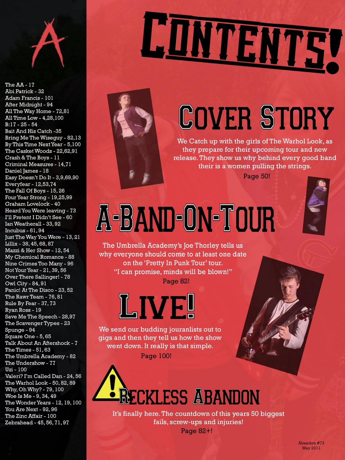
My contents page is more influenced by NME more than anywhere. The way that the bands are alphabetically listed, with page references, is typical of The New Musical Express. Even though the format and layout is influenced by NME I tries to make the contents page much more influenced by the genre and Pop-Punk artwork than anywhere else. This is why again a scrapbook style is used and the varsity fonts come in (originating from the genre being American based). The informal captions under each story headline and the use of familiar icons (e.g. the caution sign) is adapted from the magazine Front, which is an all round lads mag. The serif font and and faded background image are more influenced by Q and Uncut. These are the only features of my magazine that make it seem formal. Finally, like the majority of music magazines I have applied a colour theme, made up of Red, Black & White, which I kept for both my cover and contents page. In this way I have not challenged conventions as I feel it is appropriate and less visually confusing for the reader if you keep a general colour theme.
Double-Page Spread
As I mentioned previously some of the artwork is completely centered around how the band wants to be portrayed. My fictitious band 'The Warhol Look' have opted for a more 60's dark feel. Much like bands such as Panic! at the disco and Angels & Airwaves. Kerrang! and Rocksound both produce their articles like this. They are keen to please the bands and represent them in the way they wish to be represented. This is the reason that the artwork and colour theme have both changed drastically for my double page spread. I wanted to show that there are many sub-genre's within Pop-Punk such as power pop, dark pop, emo and crunkcore. However you can still clearly tell that the double page spread belongs to the same magazine. This is because of the fonts, relaxed interview style, format and use of a tag line. These are constant and work as a sort of signature for the magazine.
Who is the target audience for my magazine?
There is a mass audience for Abandon, many teenagers across the UK read magazines similar to it such as Kerrang! and Rocksound. Followers of Pop-Punk also tend to be very dedicated to music and will often follow their favourite bands religiously. However, due to the genre being much more dominant in North America the mass target audience will be made smaller by limiting the magazine to the UK. For this reason Abandon could be sold online to reach a much wider international audience.
Age- 13-24 (This is a rough estimate and is likely to expand on both ends)
Gender- My magazine is not intended to be gender specific however NRS shows that the magazines that I have taken my influences from have slightly higher male readership bases. This difference however is in my opinion not wide enough to be influential over the production of the magazine.
Interests- The interests of my target audience are very typical of many teenagers. They are likely to enjoy such things as gigs, festivals, parties and also will probably have very hectic social lives. Basically charismatic and friendly music lovers.
Lifestyle- My target audience's lifestyle is likely to revolve around education and part-time employment.
Socioeconomic Group- There is no economic group bias to Abandon in the slightest. Trying to categorise my audience by this would completely go against the message that the genre is trying to portray. The idea that anyone, no matter what their class status, can enjoy & unite over their troubles and the instant gratification that the music provides.
Penumbra Effect- Many people will indirectly consume my magazine as it has such a social audience. Many of the ideas and articles will often be discussed in social circumstances. This can have both a negative and positive affect. Negatively it may cause the magazine to be shared between people, directly lowering sales. On the other hand the social discussion works as a form of advertising via word of mouth.
How did I address/attract my target audience?
My audience is catered for very well with this magazine. As my interviews and public reviews will show you. I achieved this through using casual and relatable themes for my target audience, Casual interviews, eye-catching colours, vibrant photos and references to the artists personal lives. The pictures also represent my target social group and the activities that they partake in. As previously mentioned the language is informal, unlike my influences however I have not used direct address as I want the info and articles to appeal to a large group and be shared rather than have the reader think it is all about their views and interests. To further attract my target audience it has been suggested that Abandon includes a free gift each month such as a CD.
How does my magazine represent a particular social group?
The preferred reading of my magazine will represent my target social group in a positive way. The social group that my text represents consists of what is knows as greb, emo and scene kids. There the ones you see in town where they're all hugging each other and you're not sure which ones are which. However, even though personally I show some distain towards this social clique my magazine should represent them as social, active and charismatic.
What media institution would distribute my magazine?
My magazine has a mass appeal similar to Kerrang!'s therefore using the same distributor as them would have a very positive influence. Bauer should be able to effectively make sure that Abandon is reaching it's target audience via selling location and geographical area. Because of the mass appeal, Abandon can be sold almost everywhere; High street stores (such as WHS), Supermarkets and even small news-agents. However, as previously mentioned, the magazine would suffer if it was not distributed online to try and reach it's entire target audience.
Preliminary vs. Full product
Since the prelim my understanding of the production of a media text has grown immensely. The main point that I have learnt is the importance of the target audience. With my prelim I just dug my claws straight in and threw out random ideas that I thought looked cool; there was no actual acknowledgment of a target audience during production. However with my real product, the target audience were identified before anything else, the features of my magazine were then based around the target audience. My editing skills have also improved, the images on my prelim are a lot less polished and look extremely unprofessional. One idea that carried over from the prelim however was the constant colour theme, I knew that this idea would be Incorporated into my magazine from a very early stage. There are also slight visual influences that can be seen on the contents page, the layout has similarities and the scrapbook/straight edge picture style is also used in both. Finally, the amount of detail and care that went into my full product was at least quadrupled. With the full product I had to play the part of writer, editor, photographer and CEO (I managed to keep busy) going through the processes of each of these roles such as taking and writing up the article, editing the article, taking appropriate photographs and then handling how the finished product would be sold, really opened my eyes to the world of journalism and publication.
Abandon very much so draws upon influences from the magazines I read such as NME, Kerrang!, Rocksound, Q and Total Guitar. How each section is influenced by existing conventions is shown below along with how it challenges these conventions.
Front Cover
My front cover is probably the most influenced section of my magazine. Firstly focusing on the header, it is clearly very much influenced by Rocksound. The layout is very similar, the lettering for the name is bold and instantly catches the eye of the viewer. The tag line "Britain's Loudest Music Mag!" is also a familiar characteristic of teen based rock magazines, however they are more often applied to the brands themselves rather than the actual magazine. For example Kerrang!'s is "Life Is Loud" however they use this for their TV channel and Radio station rather than for the actual magazine. In terms of images, my magazine is pretty unique. The photo's themselves are similar to those which may be included in Rocksound, in the way that they are casual and are of things relevant to the genre of music. However, as with my contents page, on the front cover I have Incorporated a more rough and casual scrapbook style. The photo's are also pretty basic and are not edited to an extreme extent, which means that the audience will be able to relate to the images on a more personal level. The incorporation of a very different style at the bottom is due to band representation which I will explain more in the double-page spread section.
Contents Page
My contents page is more influenced by NME more than anywhere. The way that the bands are alphabetically listed, with page references, is typical of The New Musical Express. Even though the format and layout is influenced by NME I tries to make the contents page much more influenced by the genre and Pop-Punk artwork than anywhere else.
 This is why again a scrapbook style is used and the varsity fonts come in (originating from the genre being American based). The informal captions under each story headline and the use of familiar icons (e.g. the caution sign) is adapted from the magazine Front, which is an all round lads mag. The serif font and and faded background image are more influenced by Q and Uncut. These are the only features of my magazine that make it seem formal. Finally, like the majority of music magazines I have applied a colour theme, made up of Red, Black & White, which I kept for both my cover and contents page. In this way I have not challenged conventions as I feel it is appropriate and less visually confusing for the reader if you keep a general colour theme.
Double-Page Spread
As I mentioned previously some of the artwork is completely centered around how the band wants to be portrayed. My fictitious band 'The Warhol Look' have opted for a more 60's dark feel.
 Much like bands such as Panic! at the disco and Angels & Airwaves. Kerrang! and Rocksound both produce their articles like this. They are keen to please the bands and represent them in the way they wish to be represented. This is the reason that the artwork and colour theme have both changed drastically for my double page spread. I wanted to show that there are many sub-genre's within Pop-Punk such as power pop, dark pop, emo and crunkcore. However you can still clearly tell that the double page spread belongs to the same magazine. This is because of the fonts, relaxed interview style, format and use of a tag line. These are constant and work as a sort of signature for the magazine.
Who is the target audience for my magazine?
There is a mass audience for Abandon, many teenagers across the UK read magazines similar to it such as Kerrang! and Rocksound. Followers of Pop-Punk also tend to be very dedicated to music and will often follow their favourite bands religiously. However, due to the genre being much more dominant in North America the mass target audience will be made smaller by limiting the magazine to the UK. For this reason Abandon could be sold online to reach a much wider international audience.
Age- 13-24 (This is a rough estimate and is likely to expand on both ends)
Gender- My magazine is not intended to be gender specific however NRS shows that the magazines that I have taken my influences from have slightly higher male readership bases. This difference however is in my opinion not wide enough to be influential over the production of the magazine.
Interests- The interests of my target audience are very typical of many teenagers. They are likely to enjoy such things as gigs, festivals, parties and also will probably have very hectic social lives. Basically charismatic and friendly music lovers.
Lifestyle- My target audience's lifestyle is likely to revolve around education and part-time employment.
Socioeconomic Group- There is no economic group bias to Abandon in the slightest. Trying to categorise my audience by this would completely go against the message that the genre is trying to portray. The idea that anyone, no matter what their class status, can enjoy & unite over their troubles and the instant gratification that the music provides.
Penumbra Effect- Many people will indirectly consume my magazine as it has such a social audience. Many of the ideas and articles will often be discussed in social circumstances. This can have both a negative and positive affect. Negatively it may cause the magazine to be shared between people, directly lowering sales. On the other hand the social discussion works as a form of advertising via word of mouth.
How did I address/attract my target audience?
My audience is catered for very well with this magazine. As my interviews and public reviews will show you. I achieved this through using casual and relatable themes for my target audience, Casual interviews, eye-catching colours, vibrant photos and references to the artists personal lives. The pictures also represent my target social group and the activities that they partake in. As previously mentioned the language is informal, unlike my influences however I have not used direct address as I want the info and articles to appeal to a large group and be shared rather than have the reader think it is all about their views and interests. To further attract my target audience it has been suggested that Abandon includes a free gift each month such as a CD.
How does my magazine represent a particular social group?
The preferred reading of my magazine will represent my target social group in a positive way. The social group that my text represents consists of what is knows as greb, emo and scene kids. There the ones you see in town where they're all hugging each other and you're not sure which ones are which. However, even though personally I show some distain towards this social clique my magazine should represent them as social, active and charismatic.
What media institution would distribute my magazine?
My magazine has a mass appeal similar to Kerrang!'s therefore using the same distributor as them would have a very positive influence. Bauer should be able to effectively make sure that Abandon is reaching it's target audience via selling location and geographical area. Because of the mass appeal, Abandon can be sold almost everywhere; High street stores (such as WHS), Supermarkets and even small news-agents. However, as previously mentioned, the magazine would suffer if it was not distributed online to try and reach it's entire target audience.
Preliminary vs. Full product
Since the prelim my understanding of the production of a media text has grown immensely. The main point that I have learnt is the importance of the target audience. With my prelim I just dug my claws straight in and threw out random ideas that I thought looked cool; there was no actual acknowledgment of a target audience during production. However with my real product, the target audience were identified before anything else, the features of my magazine were then based around the target audience. My editing skills have also improved, the images on my prelim are a lot less polished and look extremely unprofessional. One idea that carried over from the prelim however was the constant colour theme, I knew that this idea would be Incorporated into my magazine from a very early stage. There are also slight visual influences that can be seen on the contents page, the layout has similarities and the scrapbook/straight edge picture style is also used in both. Finally, the amount of detail and care that went into my full product was at least quadrupled. With the full product I had to play the part of writer, editor, photographer and CEO (I managed to keep busy) going through the processes of each of these roles such as taking and writing up the article, editing the article, taking appropriate photographs and then handling how the finished product would be sold, really opened my eyes to the world of journalism and publication.
Friday, 22 April 2011
Abandon Logo

I have finally designed a logo for my magazine. After several failed attempts I decided simplicity was the key so I have decided on the image you see here. It doesn't look very affective on here but on my contents page it looks pretty epic.
Tuesday, 19 April 2011

Slam Dunk Festival
Coviniently a festival has just been launched called the Slam Dunk festival. This will be the only pop-punk festival in the UK and the bands that are playing clearly represent the pop-punk masses. Here is a picture of the tour poster which includes all the bands logo designs.


Thursday, 14 April 2011
Cover Update

I've almost finished my cover, the only thing holding me back has been the actual lettering for my logo. I have designed 7 now, once I have chosen one of these and added it on to my page, my cover will be complete.
Tuesday, 5 April 2011
The Name: Re-Visited
After a lot of consideration I have officialy decided to name my magazine 'Abandon' instead of 'Reckless Abandon' this is shorter and much easier to use for such things as article puns. The name is also snappier and rolls off the tounge.

Wednesday, 30 March 2011

Thursday, 24 March 2011
The Logo/Lettering

The Lettering of 'Reckless Abandon' will have an american college or 'varsity' style to it. This is used very often in the genre and will appeal to my audience. These are the ideas for my logo/lettering so far, however it is still possible I might shorten the name to either just 'Reckless' or 'Abandon'.

Tuesday, 22 March 2011
My Contents Page Concept

I have decided that my contents page will follow roughly the same format that NME uses each week; with a long list of bands down the left-hand side (like an index) and a few pictures to show the main articles. This will involve taking a couple of photos of other artists to go into my contents. I will also have to decide on a colour scheme before starting and then stick to it.
My Photo Shoot
I have 2 ideas for my photo shoot. The first of these is to re-create an iconic album with the members of my band. However, this will probably be hard to pull off as if it isn't done accurately it will most likely turn out quite sloppy. I do like this idea though so it remains an option. My second idea was to do 2 separate shoots using my actual band. The first shoot will be a posed one using the general pop-punk band characteristics and in a urban environment. Whereas the second shoot will involve taking live shots whilst performing. I will then mix the photos for different parts of my magazine.
Some of the iconic albums I was thinking of re-creating:
The Beatles - Abbey Road
Oasis - Definitely Maybe
Patti Smith - Horses
The Clash - London Calling
David Bowie - Aladdin Sane
Ramones - Ramones
T-Rex - The Slider
Some of the iconic albums I was thinking of re-creating:
The Beatles - Abbey Road
Oasis - Definitely Maybe
Patti Smith - Horses
The Clash - London Calling
David Bowie - Aladdin Sane
Ramones - Ramones
T-Rex - The Slider
Thursday, 17 March 2011
The Pop-Punk Evolution
It is not clear when the term pop punk was first used, but pop-influenced punk rock had been around since the mid- to late-1970s. An early use of the term pop punk appeared in a 1977 New York Times article, "Cabaret: Tom Petty's Pop Punk Rock Evokes Sounds of 60s". In the mid-1990s, the California pop punk bands Green Day and The Offspring really kicked the genre as a seperate entity off to a start.
power pop bands of the late 1960s and early 1970s helped lay the groundwork for the pop punk sound, which emerged at the onset of punk rock around 1974 with the Ramones. The Ramones' loud and fast melodic minimalism differentiated them from other bands in New York City's budding art rock scene, but pop punk was not considered a separate subgenre until later. Several UK bands of the late 1970s also played what can be considered pop punk. The music of the Buzzcocks, Generation X, The Jam, The Rezillos, The Undertones and The Toy Dolls (to name a few) featured catchy melodies, as well as lyrics that sometimes dealt with relatively light themes such as teenage romance. The US band Bad Religion, who started in 1979, were another band that helped lay the groundwork for contemporary pop punk.
By 1981, hardcore punk had emerged in the United States, with louder, faster music than punk bands. Vocal harmony, melodic instrumentation and 4/4 drumming were replaced with shouting, discordant instrumentation, and experimental rhythms. A few bands, such as Descendents, Screeching Weasel, and The Vandals, began to combine hardcore with pop music to create a new, faster pop punk sound, sometimes referred to as popcore or skatecore. Their positive yet sarcastic approach began to separate them from the more serious hardcore scene. In the 1980s, the term pop punk was used in publications such as Maximum RocknRoll to describe bands similar to Social Distortion and Agent Orange.
Tuesday, 15 March 2011
Media Theories
The hypodermic needle model is the theory that the media 'injects' messages to their audience which they play a passive part in and are unable to resist. This theory is now discredited as it is simplistic and out dated. It is suggested that people are not as passive anymore. Although to some extent, peoples opinions are influenced by what they see or hear through media.
Cultivation effect (Drip, drip, drip effect) is when the repetition of a message or opinion has an effect on an audience; causing them to believe the opinion that the media source is putting across. Music magazines often use this as a means of advertising albums and live events.
Two-step flow. Step 1 - media introduces an idea. Step 2 - these ideas are discussed with friends and we reach an opinion. This definitely applies to music magazines. Music magazines introduce an audience to artists, albums, events and a whole list of other things. And from this people will always start discussing what they've read; mainly because people like to seem knowledgeable.
Limited effect - the idea that we are not at all affected by the media as we are 'media literate'. However, in modern times it can clearly be seen that media affects everyone. Whether it's the radio jingles someone hears in the morning or the adverts on a roadside bus stop.
Media Dependency is the belief that media becomes a need. So is it an addiction or a choice? In my eyes it's an addiction. The majority of people spend a large amount of their day either watching TV, on the internet or reading magazines. Without having these media sources people would have no means of obtaining current news or be simply entertain themselves.
Diversion is the theory that people use media as an escape from reality or problems, to distract themselves. This can be applied to the majority of media and works for a lot of people
Personal relationships is using media as topic conversations with friends and using media as a substitute for real contact. This theory applies as magazines offer opinions and often new music which you will then discuss with your friends; however I doubt very many people use media as a substitute for socialisation.
Personal identity is the idea that people use media to define themselves. I think this is true to all media especially things like music magazines. Who people are friends with, how they dress, how they act is all influenced by their interests which are made evident through the media they use.
Surveillance - finding out about the world. This is one of the main appeals of a music magazine as the entire point of reading one is to find out about artists.
Tropes & Memes
Tropes are recurrent figures, images, patterns which organize a way of thinking. The repetition of a trope tends to reiterate or at least carry traces of it's historical meaning and function. They circulate as convention, but also as shorthand tactics for conveying meaning. Memes however were pitched by Dawkins as the cultural, semantic equivalent of a gene. A meme acts as a unit for carrying cultural ideas symbols or practices, which can be transmitted from one mind to another through writing, speech, gestures, rituals or other imitable phenomena.
Monday, 14 March 2011
My Title: Reckless Abandon

After a lot of thought and consideration I have settled on the name 'Reckless Abandon' for my magazine. The phrase itself means to do or say something without regards for the consequences. Firstly, this is a relevant to the attitude of my chosen genre as the music often takes this approach. Secondly, the phrase could also be seen as a reference to a relatively unknown blink-182 track. As seen below it also came out as my participants favourite name in my survey. It is also an option that I just shorten the name to 'Abandon'.

Monday, 7 March 2011
Deconstruction Of a Pop-Punk Band - Hey Monday


Hey Monday was formed in March 2008 after Cassadee Pope and Mike Gentile's former band Blake broke up. Pope and Gentile wanted to continue playing music and began holding auditions for a new band around their local Florida music scene. Pope and Gentile quickly recruited rhythm guitarist Alex Lipshaw and drummer Elliot James. Soon afterward they enlisted bassist Michael "Jersey" Moriarty and Hey Monday was formed. They were discovered when Fall Out Boy's Pete Wentz heard one of their demos while he was in the Crush Management office. Wentz wanted to sign them to his label, Decaydance, but Columbia Records was also interested so the band ended up signing a joint deal with both labels.
Hey Monday are an up & coming female fronted pop-punk band. And frankly, they opitomise the genre. They way they sound, the way they look and simply the way they go about their business just screams POP-PUNK. In terms of dress sense they are all pretty casual most of the time. Even though they make a fair amound of money, the majority of the time they look like they've just been picked up from a skate park.
"Alternative Press: You’re debut record ‘Hold On Tight’ hasn’t even been released in the UK yet. You have fans every night singing along to every word. How does that make you feel?
Cassedee Pope: We feel accomplished but have a long way to go but really surprised how kids have taken our music so far and how soon it’s all happened. We owe a lot to Pete (Wentz) promoting us and to our label Columbia and Decaydance. It’s insane!"
This is an extract from an interview Hey Monday did with Alternative Press. Like most pop-punk bands interviews tend to be casual and quite personal. How many Rock bands or Pop acts do you know that would use the term "It's Insane!"?
Their artwork tends to be extremely simple and blunt with the odd attack of colour. Like many pop-punk bands, Hey Monday have kept their visual appeal to a minimum and chosen to focus on portraying their songs and charisma as reasons for people to like them.
Subscribe to:
Posts (Atom)